shadcn Radio Group
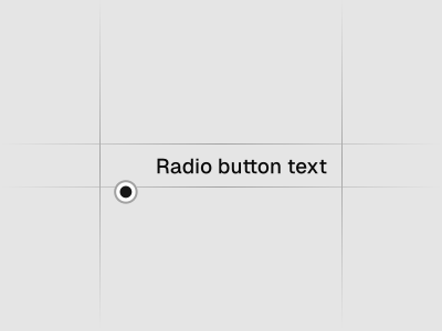
A set of checkable buttons—known as radio buttons—where no more than one of the buttons can be checked at a time. Preview it in Figma or edit it in DS Manager with your own tokens.
 Loading the Figma preview…
In the Figma kit
Checked, unchecked, disabled and focus states, with label and description layouts. The Figma component uses the same variant and size names as the React code, so the design maps directly to the component in your project.
Figma kitReact8 stylesLast updated 12 Mar 2026
Radio Group component for shadcn/ui in Figma
Radio Groups let users choose exactly one option from a small set. They’re ideal for preferences, filters or settings where mutual exclusivity is required.
Used in these blocks
2 of 437 Pro Blocks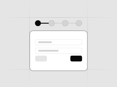
Related components
FAQs
When should I use radios vs. a select?
Use radios for 2–5 visible options; use a select when space is limited or there are many options.
Orientation guidance?
Vertical lists are easier to scan. Use horizontal when space is constrained.
Default selection?
Preselect a sensible default if appropriate, or require an explicit choice when needed.
Accessibility considerations?
Group related options with a legend and ensure keyboard navigation cycles correctly.