shadcn Input Group
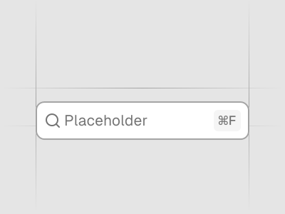
Display additional information or actions to an input or textarea. Preview it in Figma or edit it in DS Manager with your own tokens.
 Loading the Figma preview…
In the Figma kit
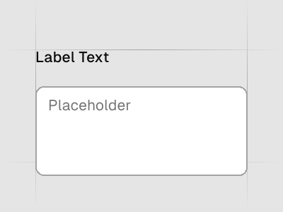
Leading and trailing addons with text, icons and buttons around inputs and textareas. The Figma component uses the same variant and size names as the React code, so the design maps directly to the component in your project.
Figma kitReact8 stylesLast updated 12 Mar 2026
Input Group component for shadcn/ui in Figma
Input Groups attach add‑ons like icons, prefixes/suffixes or buttons to inputs. They enhance clarity for formats (currency, URLs) and add quick inline actions.
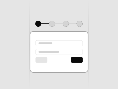
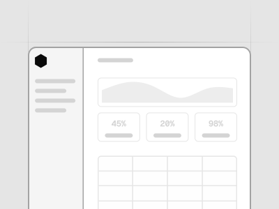
Used in these blocks
51 of 437 Pro Blocks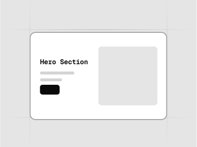
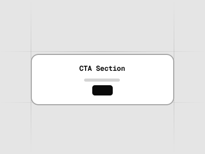
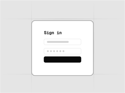
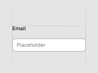
Related components
FAQs
When should I use prefixes/suffixes?
Use them to show required formats like currency symbols, units or URL protocols.
Where to place inline actions?
Place actions like Clear or Copy at the end; ensure they’re keyboard accessible.
How do I avoid clutter?
Keep add‑ons minimal and rely on helper text for complex instructions.
Responsive tips?
Allow groups to wrap or stack on narrow screens to preserve tap targets.