Carousel for shadcn/ui
A carousel with motion and swipe built using Embla.
In the Figma kit: Horizontal and vertical orientation, previous and next controls, and configurable slide sizes.
"This is the ultimate Figma kit for shadcn/ui. If I were to build a Figma kit, this is what I would've built."
shadcn
Creator of shadcn/ui
Carousel component for shadcn/ui in Figma
The Carousel showcases multiple images or cards in a compact, swipeable viewport. Use it for product shots, testimonials or featured content where users can browse horizontally.
Variants and states in the kit
Horizontal and vertical orientation, previous and next controls, and configurable slide sizes.
The Figma component uses the same variant and size names as the React code, so the design maps directly to the component in your project.
Related components
FAQs
Use it when content benefits from side‑by‑side comparison or when vertical space is limited.
Prefer manual navigation; if auto‑play is used, keep it slow and pause on hover or focus.
Provide next/previous controls and dots for position; ensure keyboard and touch support.
Lazy‑load slides and define fixed heights to avoid layout shift.
Get access to all components
Get lifetime accessForms and inputs
19 components
Button
Displays a button or a component that looks like a button.
Button Group
A container that groups related buttons together with consistent styling.
Calendar
A date field component that allows users to enter and edit date.
Checkbox
A control that allows the user to toggle between checked and not checked.
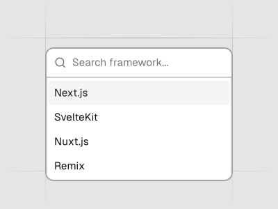
Combobox
Autocomplete input and command palette with a list of suggestions.
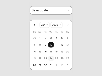
Date Picker
A date picker component with range and presets.
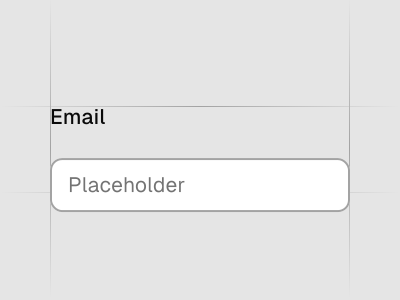
Field
Combine labels, controls, and help text to compose accessible form fields and grouped inputs.
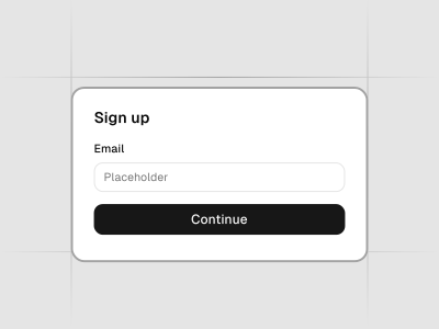
Form
A structured collection of input fields, dropdowns, checkboxes, buttons, and other UI elements designed to collect and submit data from the user. Forms are built using various components within this project, allowing for customized and dynamic user input experiences.
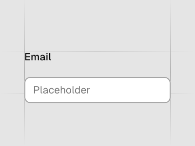
Input
Displays a form input field or a component that looks like an input field.
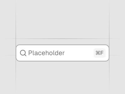
Input Group
Display additional information or actions to an input or textarea.
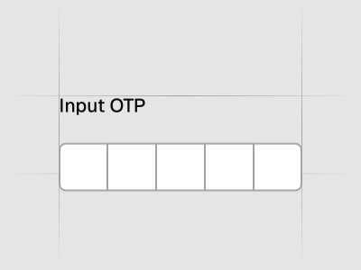
Input OTP
Accessible one-time password component with copy paste functionality.
Label
Renders an accessible label associated with controls.
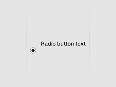
Radio Group
A set of checkable buttons—known as radio buttons—where no more than one of the buttons can be checked at a time.
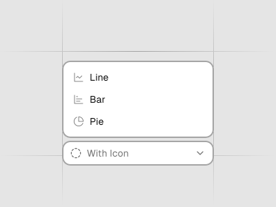
Select
Displays a list of options for the user to pick from—triggered by a button.
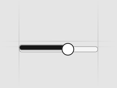
Slider
An input where the user selects a value from within a given range.
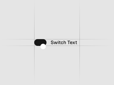
Switch
A control that allows the user to toggle between checked and not checked.
Textarea
Displays a form textarea or a component that looks like a textarea.
Toggle
A two-state button that can be either on or off.
Toggle Group
A set of two-state buttons that can be toggled on or off.
Navigation
7 components
Breadcrumb
Displays the path to the current resource using a hierarchy of links.
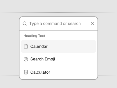
Command
Fast, composable, unstyled command menu for React.
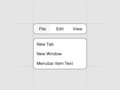
Menubar
A visually persistent menu common in desktop applications that provides quick access to a consistent set of commands.
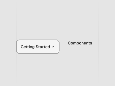
Navigation Menu
A collection of links for navigating websites.
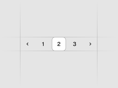
Pagination
Pagination with page navigation, next and previous links.
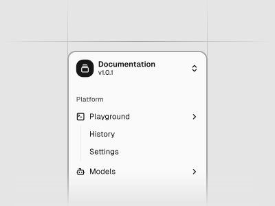
Sidebar
A composable, themeable and customizable sidebar component.
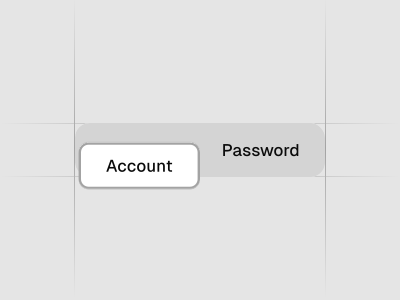
Tabs
A set of layered sections of content—known as tab panels—that are displayed one at a time.
Overlays and menus
9 components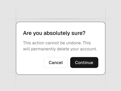
Alert Dialog
A modal dialog that interrupts the user with important content and expects a response.
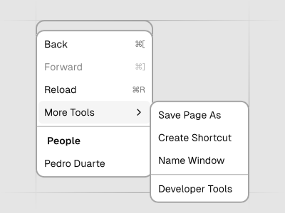
Context Menu
Displays a menu to the user — such as a set of actions or functions — triggered by a button.
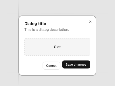
Dialog
A window overlaid on either the primary window or another dialog window, rendering the content underneath inert.
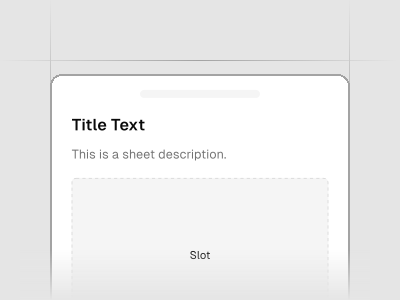
Drawer
A drawer component for React.
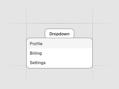
Dropdown Menu
Displays a menu to the user — such as a set of actions or functions — triggered by a button.
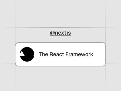
Hover Card
For sighted users to preview content available behind a link.
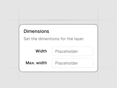
Popover
Displays rich content in a portal, triggered by a button.
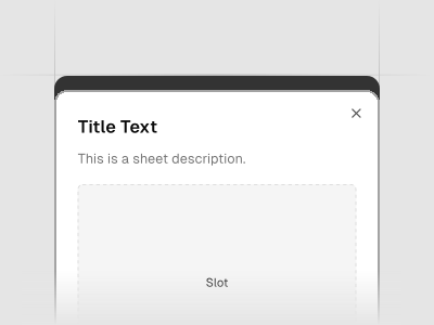
Sheet
Extends the Dialog component to display content that complements the main content of the screen.
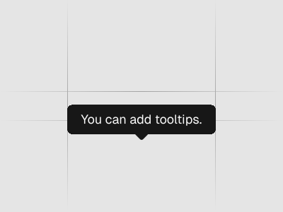
Tooltip
A popup that displays information related to an element when the element receives keyboard focus or the mouse hovers over it.
Feedback and status
8 components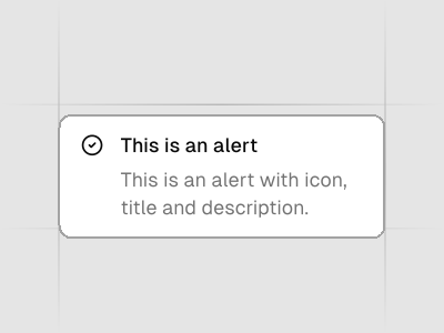
Alert
Displays a callout for user attention.
Badge
Displays a badge or a component that looks like a badge.
Empty
Use the Empty component to display a empty state.
Progress
Displays an indicator showing the completion progress of a task, typically displayed as a progress bar.
Skeleton
Use to show a placeholder while content is loading.
Sonner
An opinionated toast component for React.
Spinner
An indicator that can be used to show a loading state.
Toast
A succinct message that is displayed temporarily.
Data display
12 components
Accordion
A vertically stacked set of interactive headings that each reveal a section of content.
Avatar
An image element with a fallback for representing the user.
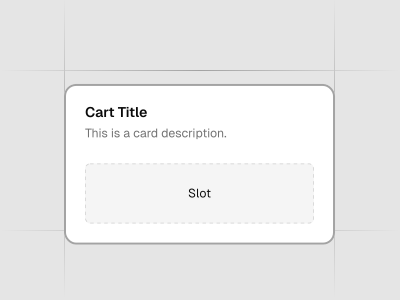
Card
Displays a card with header, content, and footer.
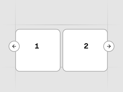
Carousel
A carousel with motion and swipe built using Embla.
Chart
Beautiful charts. Built using Recharts. Copy and paste into your apps.
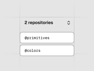
Collapsible
An interactive component which expands/collapses a panel.
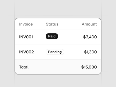
Data Table
Powerful table and datagrids built using TanStack Table.
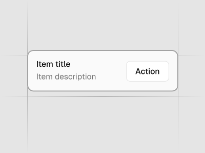
Item
A versatile component that you can use to display any content.
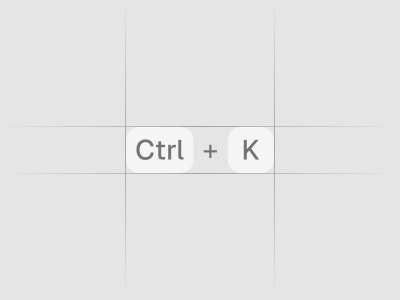
Kbd
Used to display textual user input from keyboard.
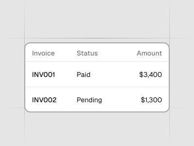
Table
A responsive table component.
Typeset
A styling system for HTML and rendered markdown, from blog posts to streaming chat. One CSS file you own.
Typography
Styles for headings, paragraphs, lists...etc
Layout
4 components
AI and chat
5 components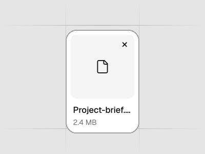
Attachment
Displays a file or image attachment with media, metadata, upload state, and actions.
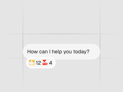
Bubble
Displays conversational content in a message bubble. Supports variants, alignment, grouping, reactions, and collapsible content.
Message
Displays a message in a conversation, with optional avatar, header, footer, and alignment.
Message Scroller
A chat scroll container that anchors turns, opens saved transcripts, follows streamed responses, loads history without jumping, and jumps to any message.
Questionnaire
A multi-step questionnaire with single-choice, multiple-choice, freeform, and skippable questions.
Icons
5 components
Icons - HugeIcons
A bold, expressive icon set with multiple styles for building distinctive product UIs.
Icons - Lucide Icons
A flexible collection of clean, consistent line icons designed for modern product interfaces.
Icons - Phosphor Icons
A flexible icon family with multiple weights and styles for building accessible, characterful interfaces.
Icons - Remix Icon
A friendly, open‑source icon set with filled and outlined variants that work well in web apps and dashboards.
Icons - Tabler Icons
A comprehensive set of outline icons with sharp geometry and great coverage for product use‑cases.
Join 8K+ pros who design & ship faster
Our ecosystem eliminates the friction between design and development. Every role gets exactly what they need to work and collaborate faster.
Designers
Ship pixel-perfect designs that developers can actually build
Design 10x faster with pre-built components and blocks
Stay current with AI tools that already understand your components
Focus on UX and conversion, not component building from scratch
Level up your skills with shadcn/ui best practices built-in
"Our company selected shadcn as our primary design library, and its been a fantastic choice. The design kit is sleek, modern, and offers excellent UX right out of the box. Its comprehensive variable system has significantly improved our efforts around branding and accessibility."
Ryan Almoneda
UX Designer @ BlackDuck