shadcn Button
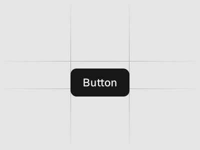
Displays a button or a component that looks like a button. Preview it in Figma or edit it in DS Manager with your own tokens.
 Loading the Figma preview…
In the Figma kit
Variants: default, secondary, destructive, outline, ghost and link. Sizes: sm, default, lg and icon. States: hover, focus, disabled and loading. The Figma component uses the same variant and size names as the React code, so the design maps directly to the component in your project.
Figma kitReact8 stylesLast updated 12 Mar 2026
Button component for shadcn/ui in Figma
When to use
- To trigger an action on the current page: save, submit a form, open a dialog or sheet.
- For the one primary action in a view, with secondary and outline buttons for the rest.
- For destructive actions that need extra weight, such as Delete project.
When not to use
- To go to another page. Use a link, or style an anchor with buttonVariants.
- For an on/off setting. Use Toggle or Switch.
- For a set of related actions in one bar. Use Button Group.
- For a status label. Use Badge.
Do and don't
Variants and states in the kit
Default
Secondary
Destructive
Outline
Ghost
Link
Sizes
With icon
Loading
Used in these blocks
187 of 437 Pro Blocks


Related components
FAQs
How many button styles should I use?
Stick to primary, secondary and destructive. Add subtle and link styles for low‑emphasis actions.
What label copy works best?
Use concise verbs like Save, Continue or Download. Avoid vague labels like Submit.
How do I handle loading states?
Show a spinner and disable the button while the action runs to prevent double clicks.
What about icon buttons?
Provide accessible labels (tooltips or aria‑labels) and keep hit targets at least 40×40px.