shadcn Button Group
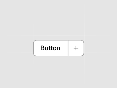
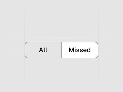
A container that groups related buttons together with consistent styling. Preview it in Figma or edit it in DS Manager with your own tokens.
 Loading the Figma preview…
In the Figma kit
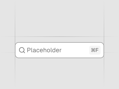
Horizontal and vertical orientation, separators, and nested inputs, selects and dropdown menus. The Figma component uses the same variant and size names as the React code, so the design maps directly to the component in your project.
Figma kitReact8 stylesLast updated 12 Mar 2026
Button Group component for shadcn/ui in Figma
Button Groups collect related actions for cleaner toolbars and forms. They enforce spacing and alignment so controls feel cohesive.
Used in these blocks
14 of 437 Pro Blocks
Related components
FAQs
When should I group buttons?
Group related actions like text formatting or table operations to reduce visual noise.
Order of actions?
Place the primary action first or last consistently and separate destructive actions.
Icon vs. text buttons?
Use icons for compact toolbars; include labels when space allows or meaning isn’t obvious.
Responsive behavior?
Wrap groups or collapse into menus on small screens to maintain readability.