Components

Card for shadcn/ui

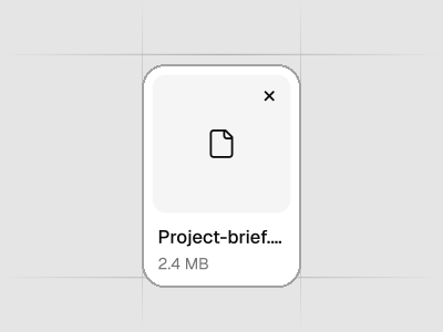
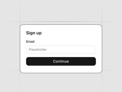
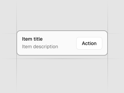
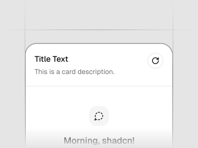
Displays a card with header, content, and footer.

In the Figma kit: Header, title, description, action, content and footer slots.

Endorsed by the creator of shadcn/ui
"This is the ultimate Figma kit for shadcn/ui. If I were to build a Figma kit, this is what I would've built."
CN

shadcn

Creator of shadcn/ui

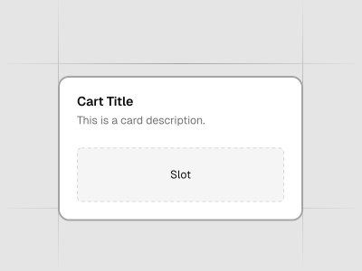
Card component for shadcn/ui in Figma

Cards group related content into a tidy container with optional header and footer. Use them for product tiles, dashboard panels or any repeatable unit where consistency matters.

Variants and states in the kit

Header, title, description, action, content and footer slots.

The Figma component uses the same variant and size names as the React code, so the design maps directly to the component in your project.

FAQs

Use cards to present repeatable content like products, posts or metrics in a grid or list.

Place primary actions in the footer or top‑right menu; keep destructive actions secondary.

If the whole card links somewhere, include hover feedback and clear focus states.

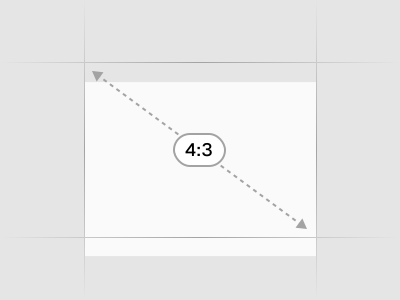
Use fixed image ratios and clamp text lines to avoid jumpy grids.

Get access to all components

Get lifetime access

Forms and inputs

19 components
Button shadcn/ui component in Figma

Button

Displays a button or a component that looks like a button.

Button Group shadcn/ui component in Figma

Button Group

A container that groups related buttons together with consistent styling.

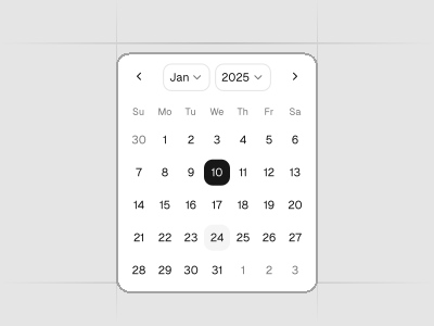
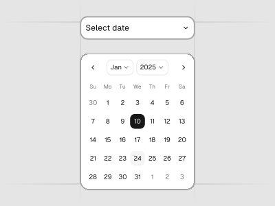
Calendar shadcn/ui component in Figma

Calendar

A date field component that allows users to enter and edit date.

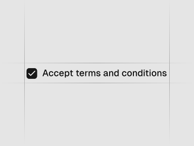
Checkbox shadcn/ui component in Figma

Checkbox

A control that allows the user to toggle between checked and not checked.

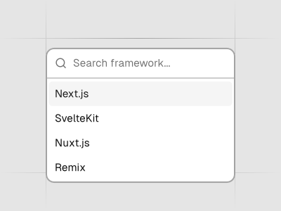
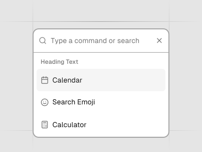
Combobox shadcn/ui component in Figma

Combobox

Autocomplete input and command palette with a list of suggestions.

Date Picker shadcn/ui component in Figma

Date Picker

A date picker component with range and presets.

Field shadcn/ui component in Figma

Field

Combine labels, controls, and help text to compose accessible form fields and grouped inputs.

Form shadcn/ui component in Figma

Form

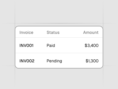
A structured collection of input fields, dropdowns, checkboxes, buttons, and other UI elements designed to collect and submit data from the user. Forms are built using various components within this project, allowing for customized and dynamic user input experiences.

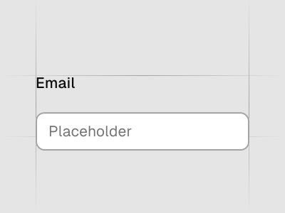
Input shadcn/ui component in Figma

Input

Displays a form input field or a component that looks like an input field.

Input Group shadcn/ui component in Figma

Input Group

Display additional information or actions to an input or textarea.

Input OTP shadcn/ui component in Figma

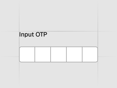
Input OTP

Accessible one-time password component with copy paste functionality.

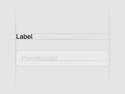
Label shadcn/ui component in Figma

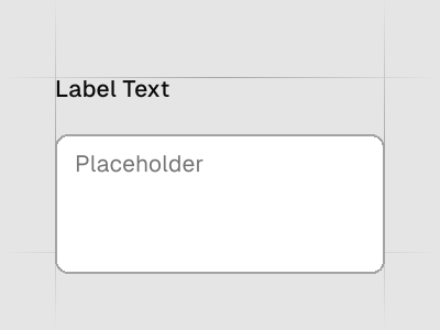
Label

Renders an accessible label associated with controls.

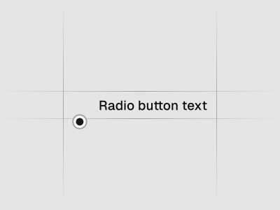
Radio Group shadcn/ui component in Figma

Radio Group

A set of checkable buttons—known as radio buttons—where no more than one of the buttons can be checked at a time.

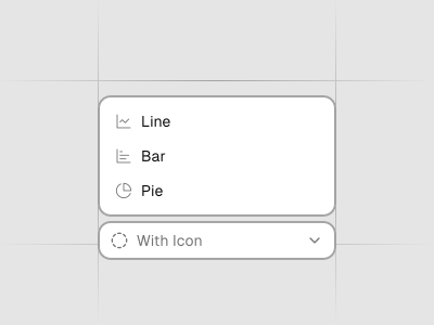
Select shadcn/ui component in Figma

Select

Displays a list of options for the user to pick from—triggered by a button.

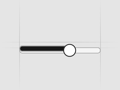
Slider shadcn/ui component in Figma

Slider

An input where the user selects a value from within a given range.

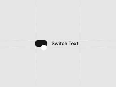
Switch shadcn/ui component in Figma

Switch

A control that allows the user to toggle between checked and not checked.

Textarea shadcn/ui component in Figma

Textarea

Displays a form textarea or a component that looks like a textarea.

Toggle shadcn/ui component in Figma

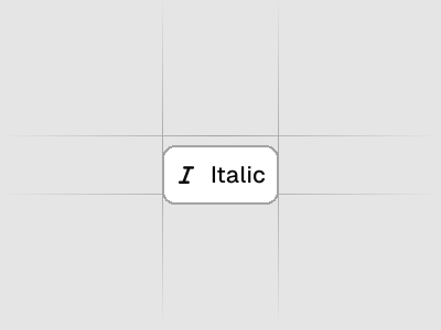
Toggle

A two-state button that can be either on or off.

Toggle Group shadcn/ui component in Figma

Toggle Group

A set of two-state buttons that can be toggled on or off.

Overlays and menus

9 components

Feedback and status

8 components

Data display

12 components

Layout

4 components

AI and chat

5 components

Icons

5 components
Who is it for?

Join 8K+ pros who design & ship faster

Our ecosystem eliminates the friction between design and development. Every role gets exactly what they need to work and collaborate faster.

Designers

  • Ship pixel-perfect designs that developers can actually build

  • Design 10x faster with pre-built components and blocks

  • Stay current with AI tools that already understand your components

  • Focus on UX and conversion, not component building from scratch

  • Level up your skills with shadcn/ui best practices built-in

"Our company selected shadcn as our primary design library, and its been a fantastic choice. The design kit is sleek, modern, and offers excellent UX right out of the box. Its comprehensive variable system has significantly improved our efforts around branding and accessibility."

Ryan Almoneda

UX Designer @ BlackDuck

Level-up your workflow today

One-time payment
14 days refund policy